
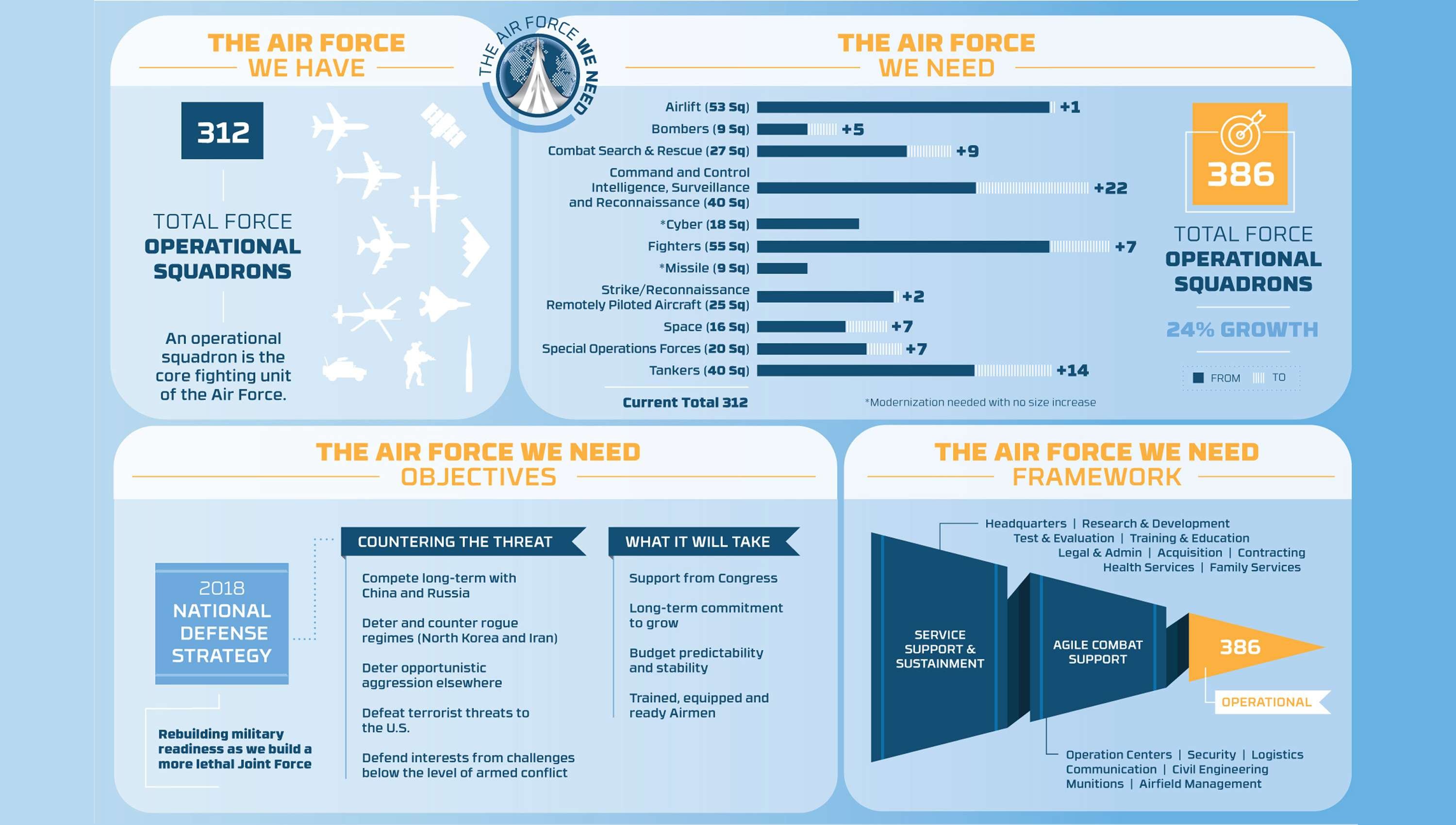
It was at the Air Force Association Air & Space Conference this year that Secretary of the Air Force, Heather Wilson, announced a plan to expand the number of operational squadrons from the current 312 to 386 by the year 2030.
While the announcement of such an ambitious goal is certainly noteworthy in its own right, I was most struck by visuals used to present their plan. In particular, this screen caught my attention.
The USAF, and the military in general, has a reputation for relying heavily on PowerPoint and also for producing some presentations that are often complicated and text heavy. The result of an uninspired template, strict guidelines and lack of design understanding are slides that are often numbingly dense and ambiguous.
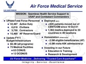
Official USAF slides are typically packed with visual clutter; logos, slogans, and graphics
that don’t necessarily advance the message.
What was presented last week was something different altogether. Three graphic design techniques the USAF has done right to make such a big impact and grab the attention of its audience.
1. Designed for a Modern Screen
They started with a slide that has a widescreen proportion. Commonly referred to as 16:9 because of the ratio of width to height, this is the standard proportion of nearly every screen and projector made in the last decade. The benefit of this proportion is greater than just the ability to fill the screen without wasting space. The wider format is also more conducive for placing text columns, charts and images side by side; something which the designer took full advantage of in their layout.
They have embraced high-definition, allowing their font sizes to be smaller and details to be finer. This may trigger a negative reaction in everyone who was brought up to design for the people in the back of the room, but the truth is display technology has improved by leaps and bounds in a relatively short period of time. Because designers have more resolution to work with, they can fit more information in a smaller space. In this case, the designer used the smaller, but still legible, fonts to keep related information closer together and more compact.
They’ve adopted a refined color palette. High-contrast, black-and-white may be considered “safe” from the standpoint of legibility, but it’s certainly not elegant. The largely monochromatic blue design implemented here is pleasing to the eye. One could even argue that it is actually less strain on a viewer to make out copy and data that isn’t so high in contrast. Subtle variations in color create boxes that help to organize the data without being intrusive. The darkest blue color is used only in places where they want to draw the viewers’ attention, such as headlines and critical information. A contrasting gold color is used sparingly, and only whenever a reference to the goal of 386 is made.
2. Good Typography
They’ve selected a unique, but highly legible, font. Every presenter wants people to remember their message, but there is nothing distinctive or memorable about Arial, Calibri or Times New Roman. Granted, it can be dangerous to use “non-standard” fonts in a presentation as not all fonts will embed with the file, and no one wants to have their slides mangled by an unexpected font substitution. In the case of this slide, however, it appears that the layout was built by a designer and then exported as a single graphic. This technique allows you to use any font you wish. One major downside is that you can’t make edits on the go, therefore it is best used only for slides where the information doesn’t need to be updated regularly.
They’ve taken advantage of the whole font family. Have you ever heard the expression, “If you make everything bold, nothing is bold?” Nowhere is this more true than in PowerPoint. By thoughtfully mixing type sizes and font weights the designer was able to add emphasis where it is needed while keeping supporting information on the screen in an unobtrusive manner.
Many lists, but not a bullet in sight. Instead of the ubiquitous typographic symbol, the designer used a variety of other techniques in order to define the lists. Line spacing, alignment and proximity all work together to show which ideas are related. A single, thin line ties the individual items to their heading.
"Some problems in the world are not bullet-izable"
-General H.R. McMaster
3. Smart Art
Icons and symbols. When used properly, symbols can reinforce or even totally replace copy. In the first box, titled “The Air Force We Have,” there are a series of symbols that represent the variety of existing squadrons. For anyone familiar with the USAF, it’s easy to glance at them and understand what they represent. Notice how they did NOT include a symbol for every type of aircraft and service the USAF supports. Instead there is one tanker, one bomber, one fighter, and so on. The key concept being communicated here is not “This is everything we have” but rather “We have everything” – it’s a subtle but important distinction.
Critical information in an easy to decipher visual. The most important data on this slide comes in the form of a bar chart; the design of which is simple, but highly effective. Bars representing the number of squadrons devoted to each mission are stacked together so that comparisons can be made. Efficient use of space is achieved by setting the bars horizontal instead of vertical, allowing the labels to be placed in line with the chart element. Instead of a scale or grid, numbers representing current and proposed squadrons are placed adjacent to the bars. This makes it easy to find the values of each segment.
Proper use of charts. Choosing the right type of chart for the message and data you’re delivering is critical. For example, bar charts (like the one referenced earlier) are great for comparing values while pie charts are good at comparing a percentage of a known value. In the box labeled “Framework,” the designer used a pyramid chart, which are used to show hierarchy, usually in conjunction with quantity or size. In this case it shows that in order to get to 386 operational squadrons the USAF must first establish “Service, Support & Sustainment,” followed by “Agile Combat Support.” It’s safe to assume that there will be more effort, personnel and resources required for that first level, and less for subsequent levels.
It’s uncertain if the USAF can achieve their desired 24% growth, but presenting their plan to the public in a clean, well thought-out format certainly isn’t going to hurt.